Z Studio
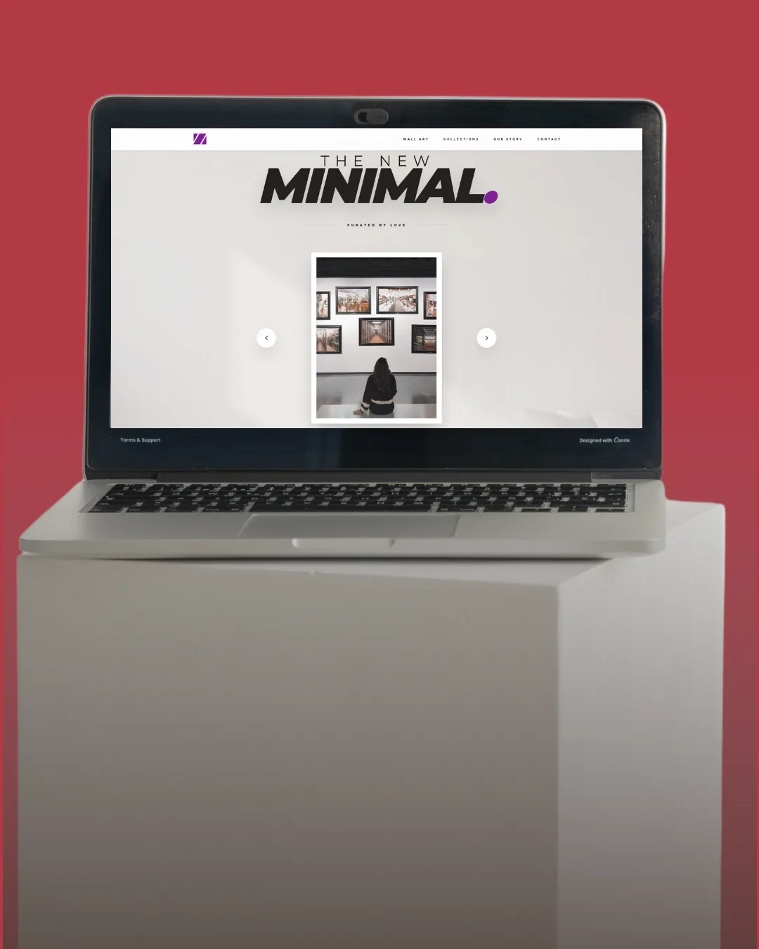
A gallery-quality storefront for a premium wall art brand, where the interface disappears so the work can do its job.
- Client
- Z Studio
- Category
- E-Commerce
- Year
- 2025
- Technology
- Astro.js · React · Tailwind CSS
The Challenge
"Z Studio makes premium wall art and posters, the kind of product where the visual presentation is the product."
The purchase decision is almost entirely emotional and aesthetic: a visitor sees something, imagines it on their wall, and either buys or doesn't. There's very little rational deliberation in the middle. But the storefront they had treated their prints like any other SKU, small product cards, a standard grid, generic e-commerce templates drowning the work in UI chrome. In a category where the interface's job is to get out of the way, the interface was the first thing you noticed.
The Approach
We stripped the interface back to almost nothing and let the work speak.
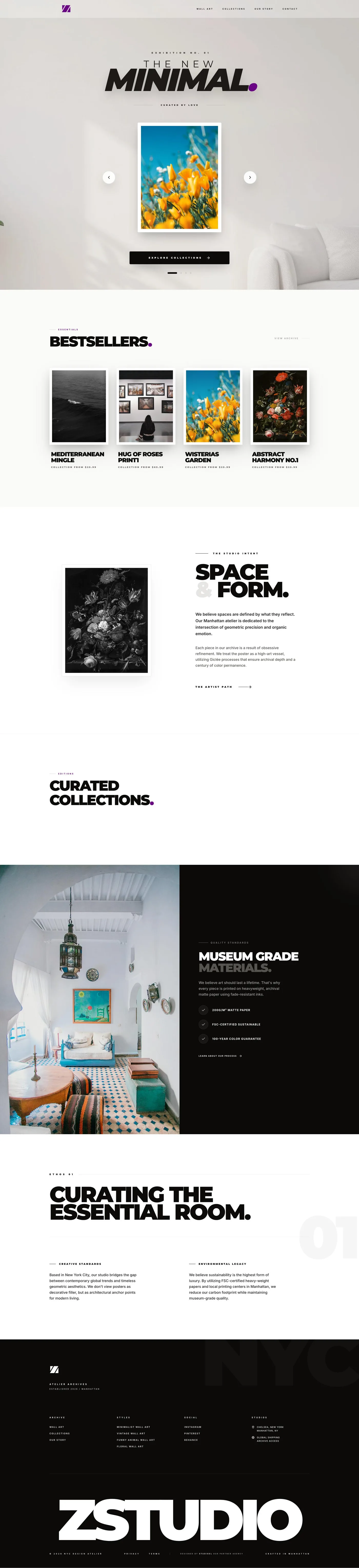
Full-bleed imagery and a breathing grid, generous margins, nothing competing with the prints
Product pages as gallery moments: one large image, clean material and size detail, minimal UI chrome
Checkout optimised for two purchase motivations: impulse buying for yourself, and gift purchasing for someone else
Brand identity, typography, colour palette, voice, developed alongside the store for full coherence
The Results
"Z Studio launched with a storefront that works as hard as the art it sells."
The gallery-like experience converts at a measurably higher rate than the category average, mainly because nothing stands between the product and the purchase decision. The brand identity developed during the project gave Z Studio a consistent visual language to carry across packaging, social media, and future collections, a foundation rather than just a launch.
Built With